BACK
Consolidating Table Design Across a Legal AI Platform
Jan - Feb 2026
(2 months)
Product Designer
(also shipped production code)
B2B SaaS
Legal AI platform
Figma, Claude code
Storybook + Chromatic
Background
Security analysts live in tables.
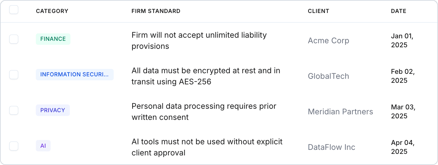
The product helps security teams answer compliance questionnaires using AI. That means they spend most of their day managing Q&A knowledge pairs, evidence documents, questionnaires, and client compliance guidelines. Tables aren't a feature of the product. They are the product.
Problem
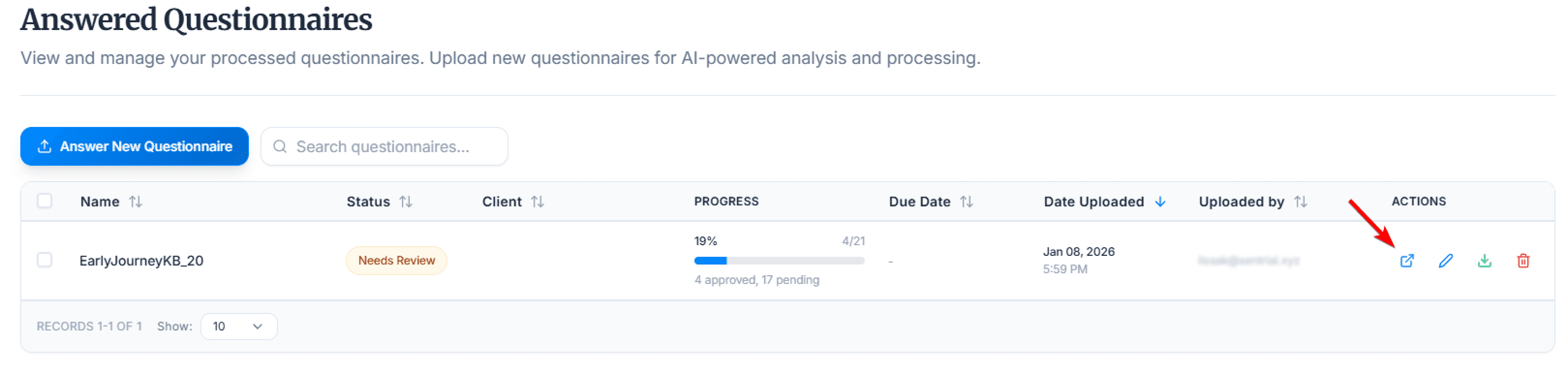
During a usability observation, a user struggled to find the action to open a processed questionnaire. The icons were small, unlabeled, and placed differently than in other views. It was a small moment, but it pointed to something bigger.
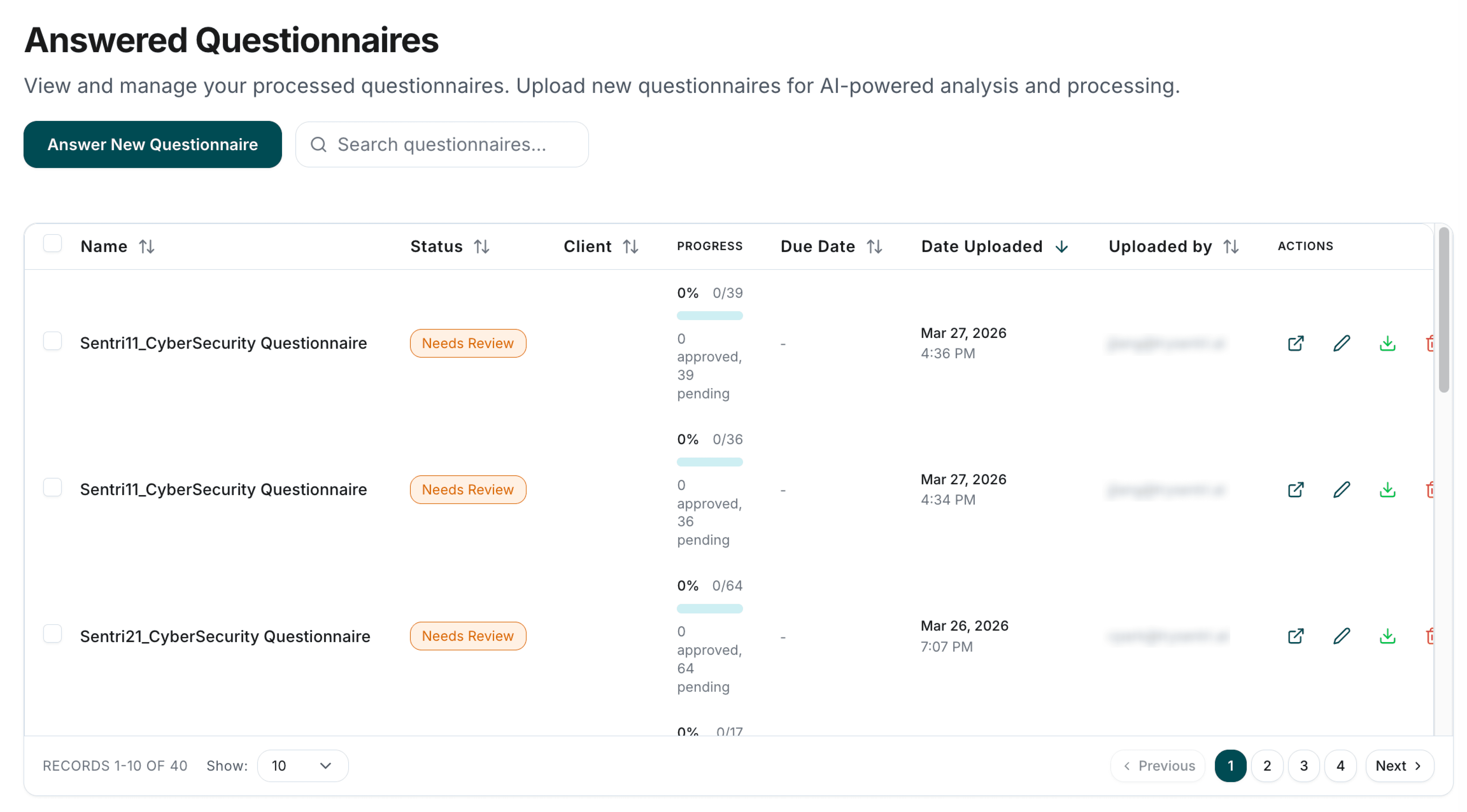
Separately, a customer uploaded files with long names and the Source column blew out, pushing everything else off screen. A layout nobody had tested for — because each table handled column overflow its own way.
Neither of these was an edge case. They were symptoms of having no shared table pattern.
audit
I audited every table in the product using claude code
Before designing anything, I needed to see what existed. I went through every data view and documented:
Row heights and cell padding
Header styling and sort behavior
Action placement and icon usage
Empty states, loading, and pagination
Upload/import button naming and icons
This gave me a clear map of what "unified" actually had to solve.
Row heights, borders, spacing, action placement, and column definitions all varied slightly across views. No single view looked broken — but moving between them, the inconsistencies added up. Storybook coverage for table components was low, so there was no single reference for how a table should look or behave.
I started designing with the hardest view.
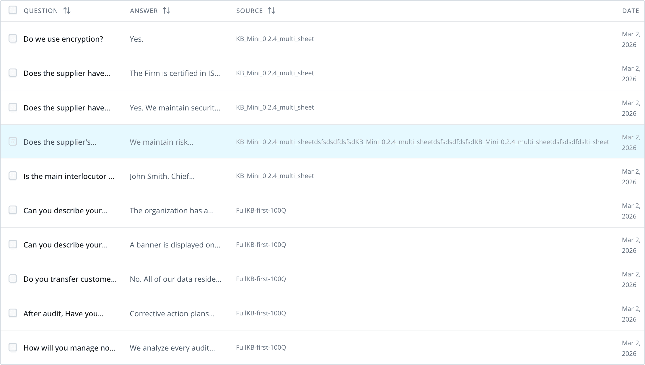
The Q&A Pairs page was the most data-dense view in the product — 600+ entries, long text in both columns, and multiple metadata fields. If the pattern worked here, it would work everywhere.
Key decisions for the base pattern:
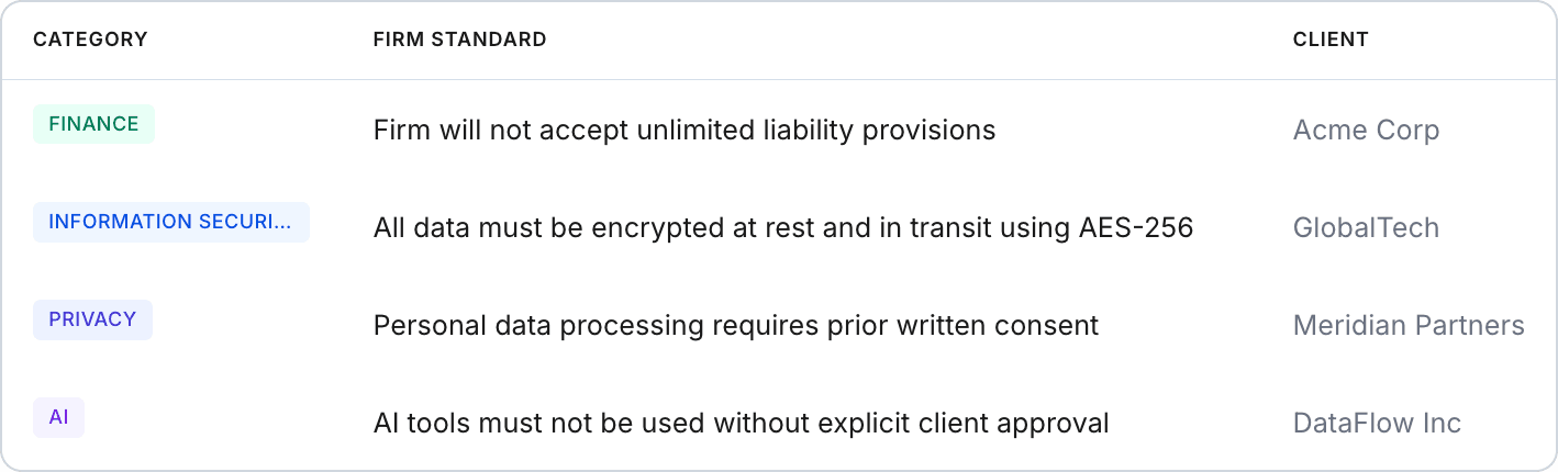
Compact row height (36–40px) — analysts need to scan volume, not admire whitespace
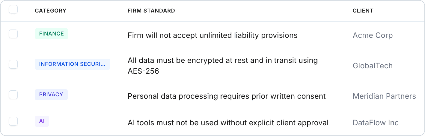
Content-first column sizing — shrank metadata columns (source, date, owner) and gave the space back to primary content
Relative dates ("2 days ago") instead of full timestamps
Consistent action placement — clear, discoverable row actions instead of scattered icon buttons
Toolbar pattern — standardized filter, search, and action button placement
Then I scaled it to every data view.
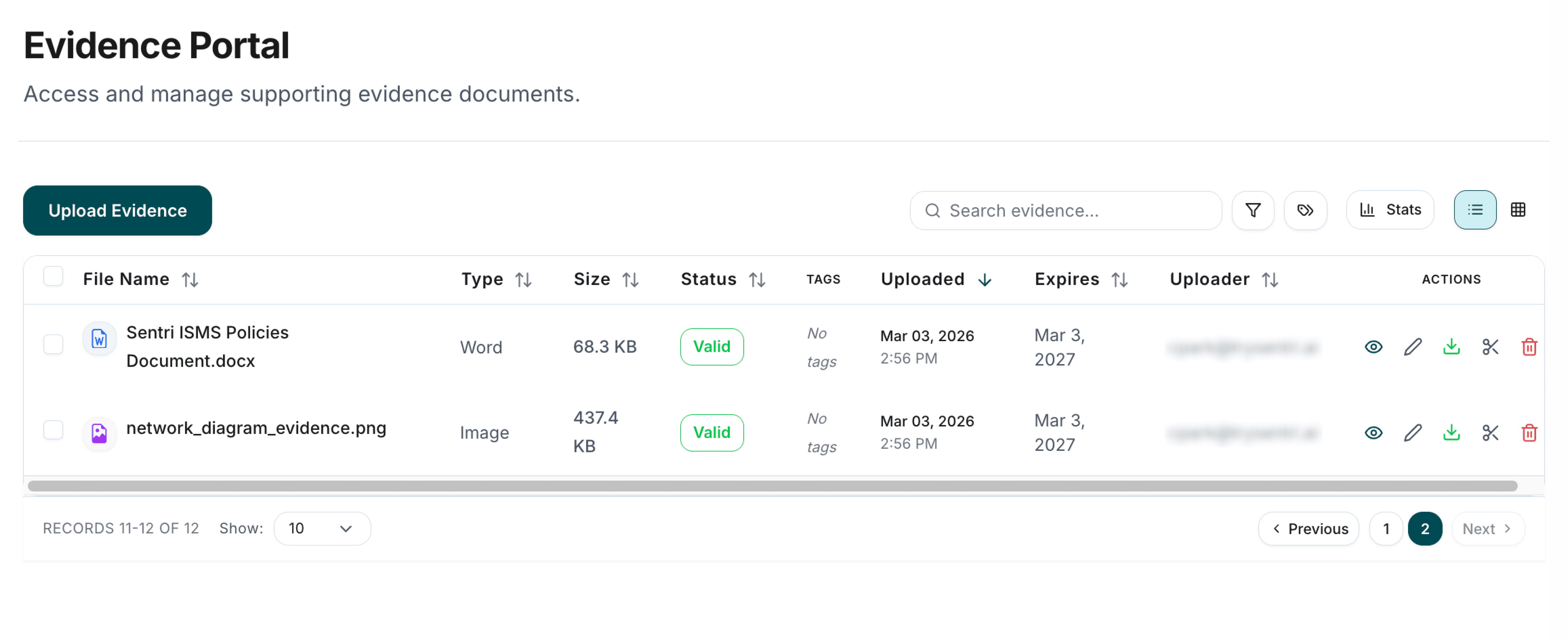
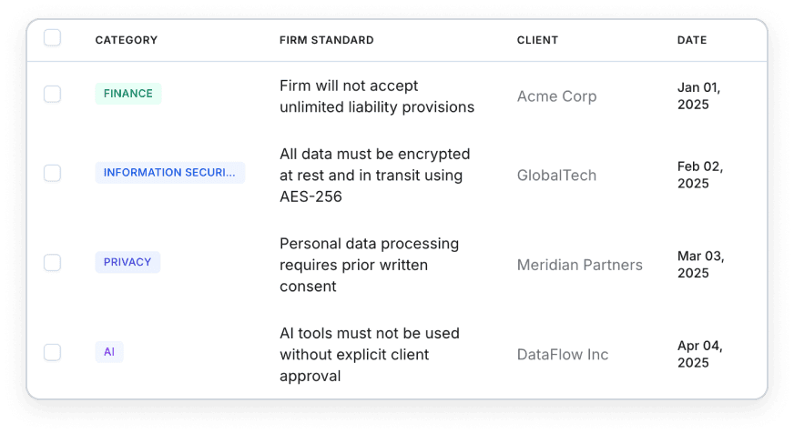
Once the Q&A table was solid, I applied the same pattern to 3 more views — Evidence Portal, Client OCGs, and Answered Questionnaires — unifying row density, header alignment, action placement, and toolbar patterns across the product.
I verified all 4 views side-by-side to confirm every detail matched.
system
Every pattern shipped as a design system component.
This wasn't a visual cleanup. Every pattern went into the product's design system, documented in Storybook and covered by Chromatic visual regression testing:
Table: default, compact, selection, sorting, actions, expandable, empty, loading states
All built in code (React / TypeScript / Tailwind) and merged to production via PRs I authored.
ai-powered workflow
I designed in Claude Code and shipped it myself.
My process isn't Figma-to-handoff. I sketch rough direction in Figma, then move into Claude Code where I design and build simultaneously — React, TypeScript, Tailwind, straight into production components.
For this project, that meant iterating directly against production-scale content. When compact row height felt off at 40px, I adjusted it and checked it against 600+ Q&A pairs in the same session. When I unified upload buttons across 4 views, I didn't file 4 tickets — I made the changes and opened one PR.
The table pattern I designed isn't a handoff artifact. It's the code running in production.
Outcome
Inconsistencies became one pattern.
4 major data views now share the same design language.
Compact density gives analysts significantly more data per screen
Storybook coverage for table components went from minimal to full
Every engineer building a new view starts from a documented, tested pattern
Every change shipped to production as code I wrote