BACK
KOIN, Cafeteria Menu Redesign
Mar to May 2024 (2 months)
Overview
KOIN is a campus app used by university students in Korea. I joined as the sole UX/UI designer on a cross-functional team of 13, working with a PM, backend, frontend, Android, and iOS engineers, to redesign the meals feature over two months.
The problem
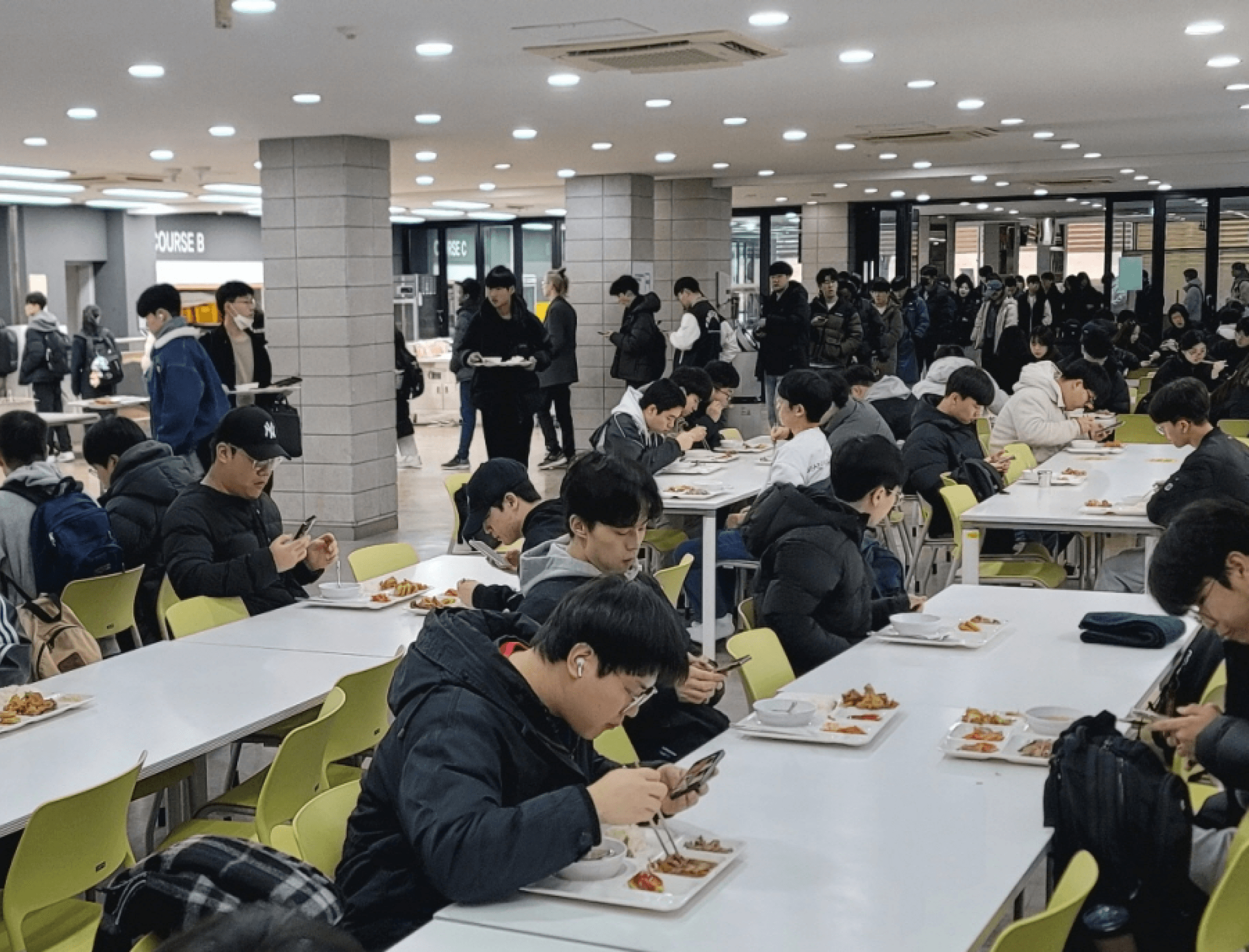
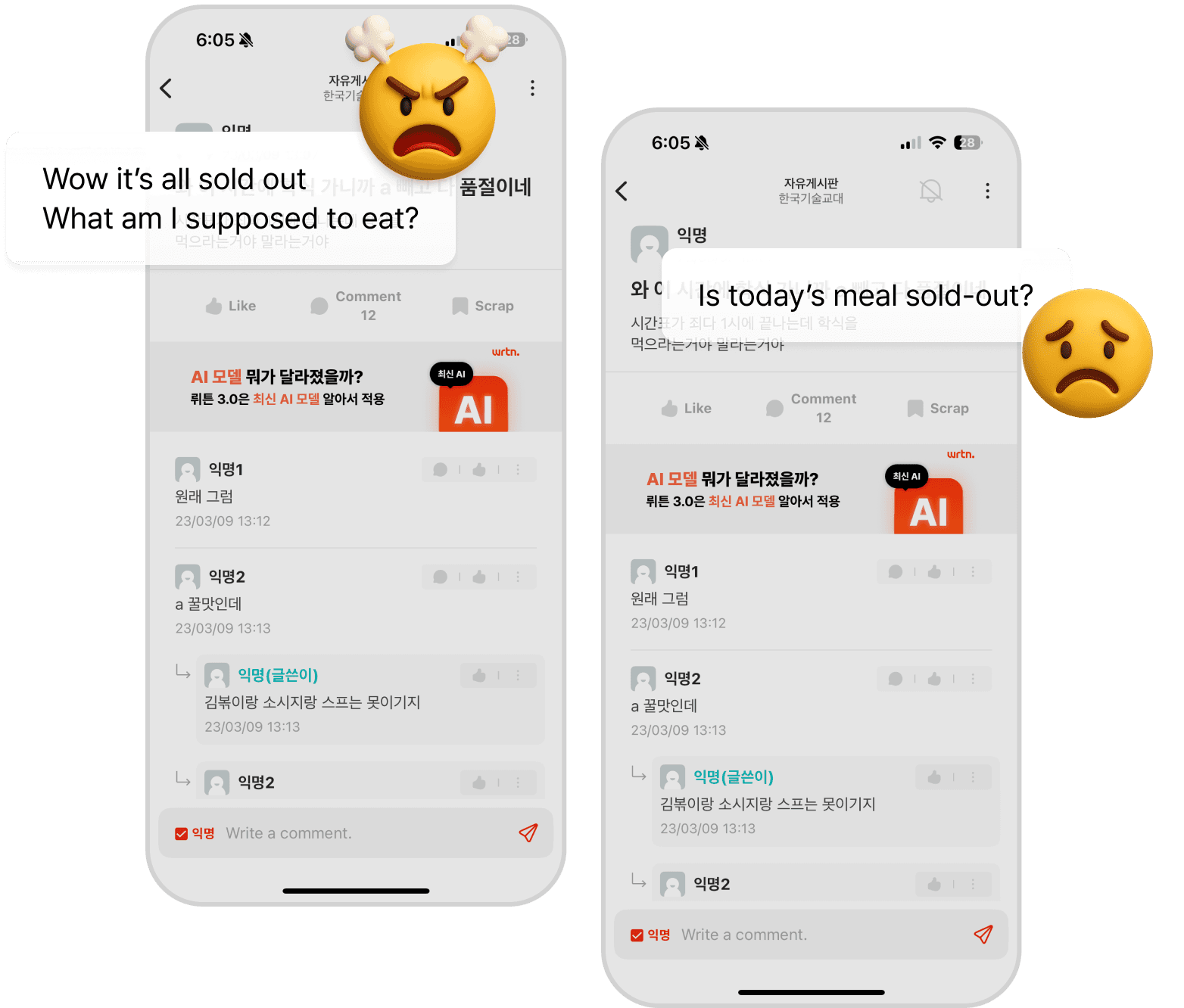
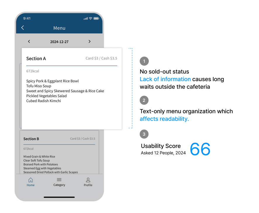
Students were rushing to the cafeteria only to find everything sold out. Because the app showed menus as text-only lists with no availability status, there was no way to know what was left before making the trip. Frustration spilled into campus community boards, with posts like "Wow it's all sold out, what am I supposed to eat?" appearing regularly.
Three core issues surfaced: no real-time sold-out status, a text-only format that was hard to scan, and no photos to help students make decisions quickly.
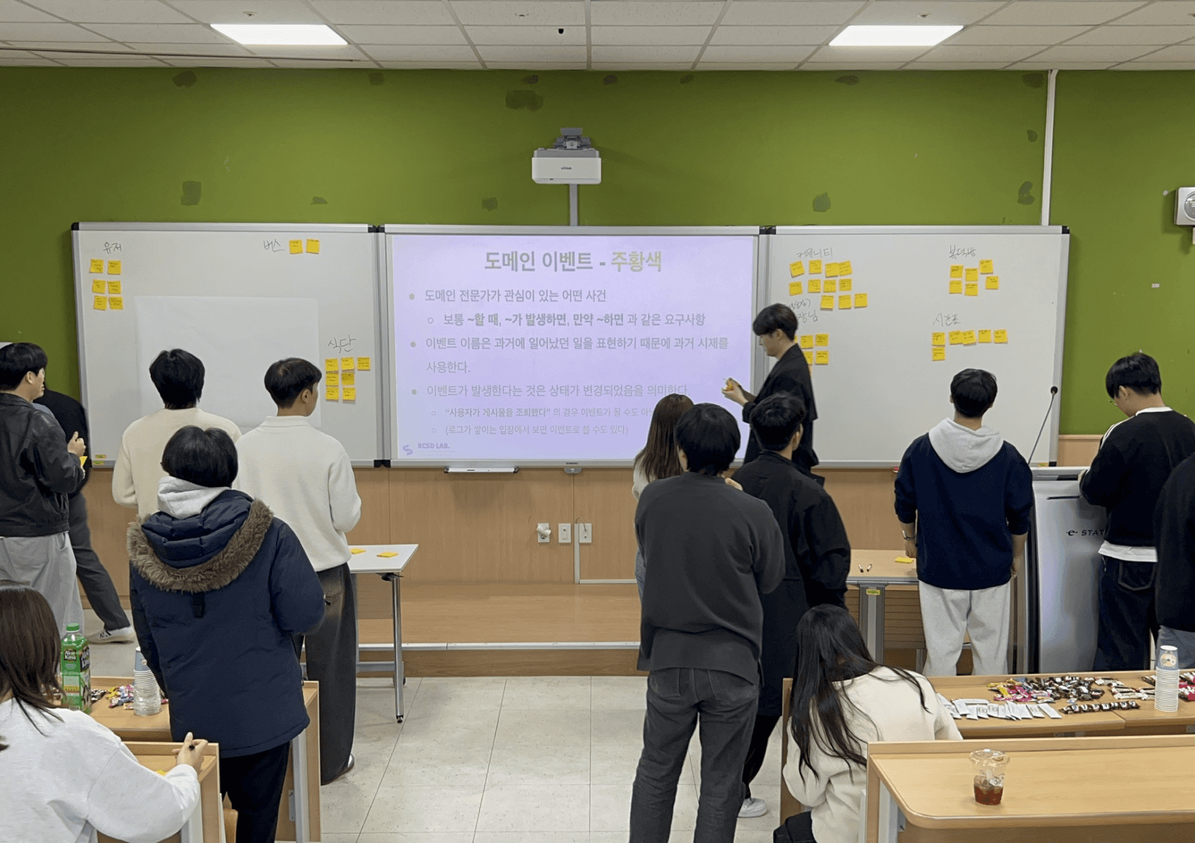
Research and Ideation
We ran an Event Storming workshop with the full team to map the entire dining experience end-to-end and identify where breakdowns were happening. The exercise made it clear that the real pain wasn't just the food running out. It was the uncertainty. Students had no way to plan ahead.
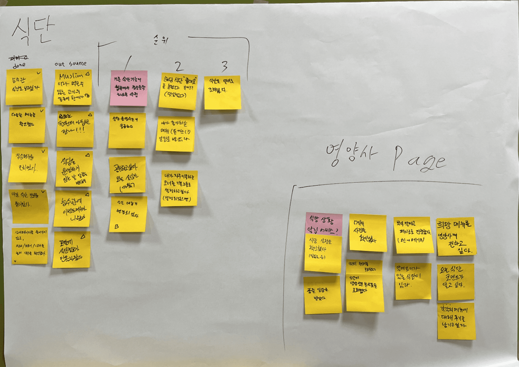
While building a journey map, the idea of uploading meal photos emerged naturally. But as we dug deeper, we realized photos alone weren't enough. What users actually needed was certainty of information, knowing whether a meal was still available before they left their seat.
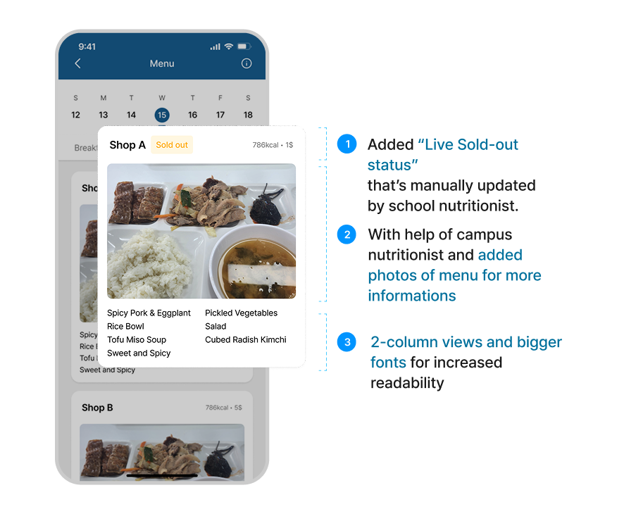
What We Changed
We made three targeted improvements to the existing design: a live sold-out status badge manually updated by the campus nutritionist, meal photos added in collaboration with the nutritionist, and a 2-column layout with larger typography for faster scanning.
The before state scored 66 on a usability test with 12 participants. After the redesign, the numbers told a clear story.
Results
Page views: +83%
Monthly active users: +33%
Usability score: +27%
Menu-related inquiries: -6%
What I Learned
At first I assumed adding images would solve the problem. The data proved otherwise. The real user need was certainty of information, not aesthetics. Seeing how a single piece of contextual information (sold-out status) could drive an 83% lift in views showed me how much impact one well-placed design decision can make.
Future Directions
The current sold-out status relies on manual updates by the nutritionist, which creates friction. A beacon-based or automated system could remove this dependency. Increased promotion of the feature is also needed to drive broader adoption among students who haven't yet changed their behavior.
BACK